Data Visualization for Family Expenses
Telekom – UX & UI
Telekom – UX & UI
Mockups of data visualisations for Telekom’s family plans.
During my work at T-Labs, I contributed to data visualizations for Telekom’s family plans, helping users understand their spending and usage across accounts. I created mockups, prototypes, and visualization examples.
Telekom
User Experience
User Interface
Information Design
Three months
Overview
Context
I joined an ongoing project: there were already frameworks, basic prototypes, and insights from research.
Team
Composed by researchers, developers, and
designers.
My design team was composed by 4 people.
Objective
Create a new visualization of the contracts & user data.
What did I do?
> User Experience: Worked closely with the research team to iterate and develop a prototype for usability testing.
- Designed user flows, dashboards, and interactive prototypes. Created the entire interface, from low-fidelity wireframes to working prototypes.
> User Interface: Applied Design System elements and adjusted the interface according to Telekom’s best practices and style guidelines. Created final resources for the development team.
> Information Design: Determined the most effective graphics for communicating each possible user scenario.
Outcome
Delivered a functional prototype and assets to the development team.
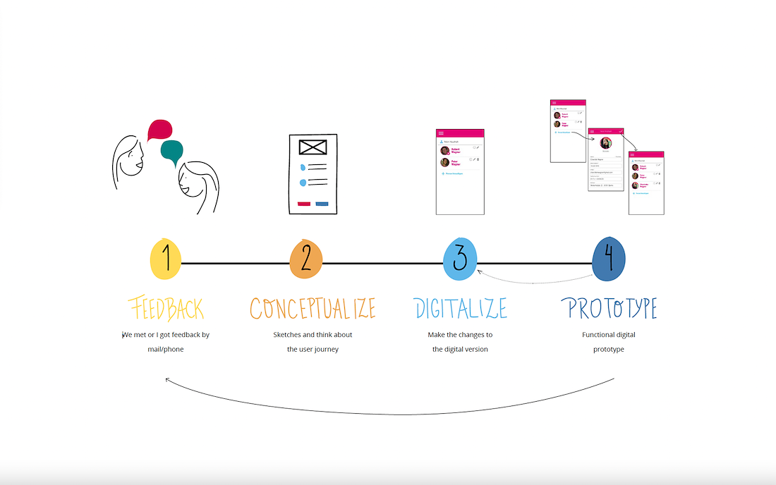
My working process.
Mockup presentations of statistics.
Result
The project was presented during the Mobile World Congress in Barcelona (February 2018)


